The entire project was designed to adapt perfectly to any device, be it a
computer, tablet or smartphone. Responsibility ensures that customers can access the menu, make
reservations, and explore the restaurant with ease, regardless of the device they are using.
Elegance.
Color Choices.
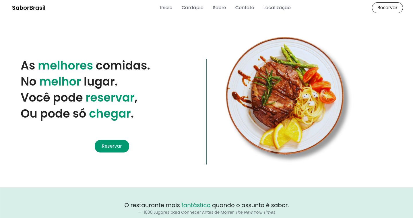
The color green (#009970)
was chosen carefully. It evokes the freshness of the ingredients
natural used
in Brazilian cuisine, such as herbs, vegetables and fruits.
Furthermore, green conveys a feeling of health and vitality, which
aligns perfectly with the
proposal from SaborBrasil.
Fluidity.
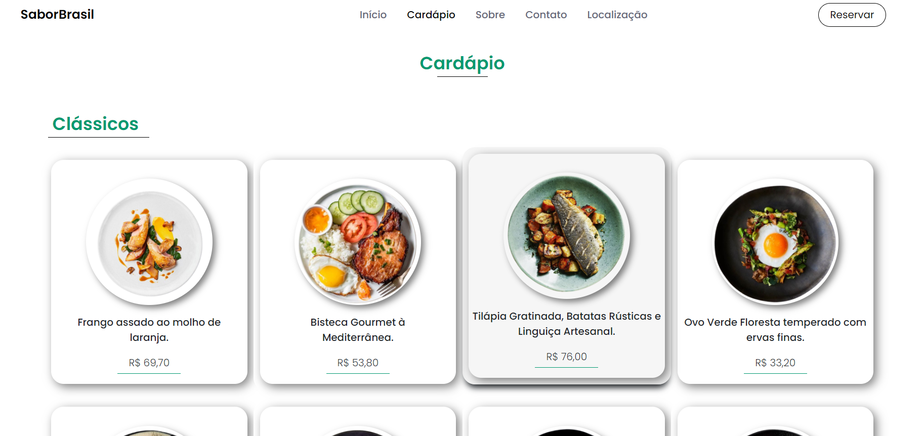
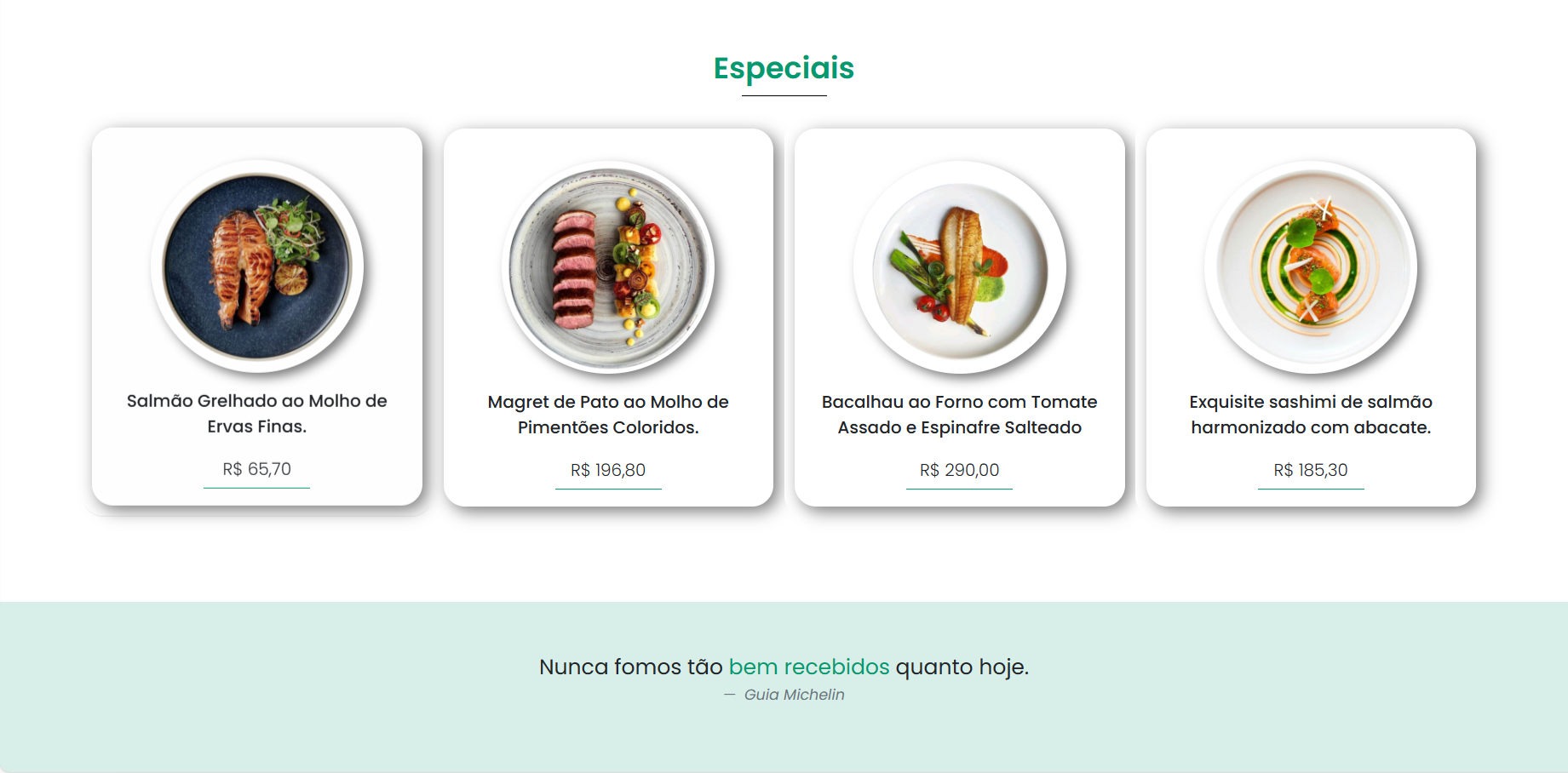
Minimalist Layout.
I opted for a clean layout and minimalist.
The visual elements are organized in a clear way, with wide spaces and
readable fonts.
This allows visitors to focus on what really matters:
A
food.
Attractive.
Interactions.
I chose to highlight interaction through buttons and clickable elements
on the website, offering users intuitive and efficient navigation. This approach simplifies access to
website information and functionality, providing a more pleasant and hassle-free user experience.